Case Study

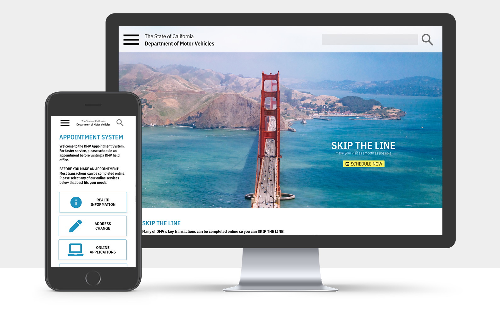
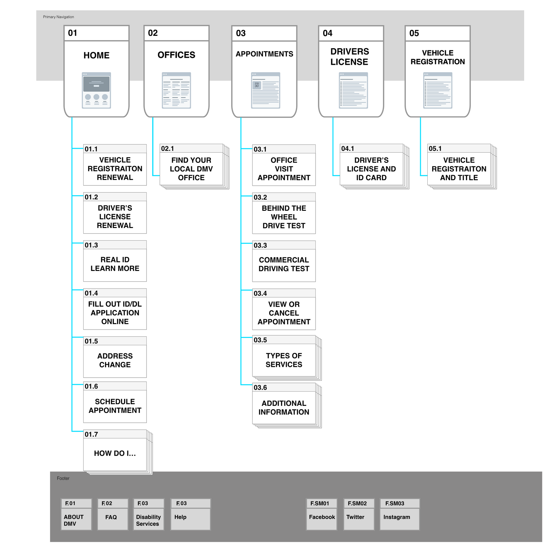
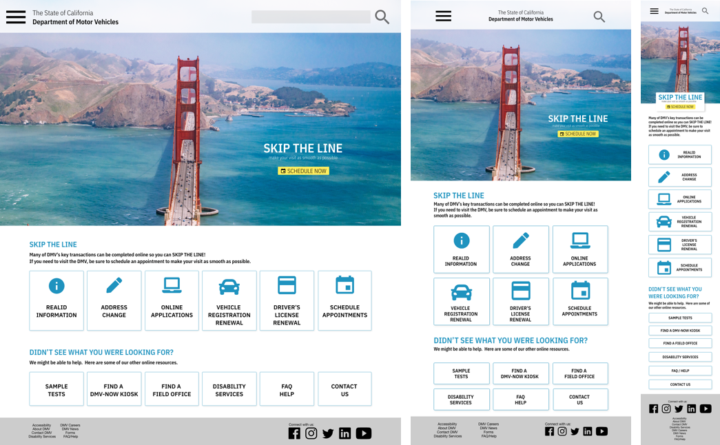
Redesigning DMV.ca.gov
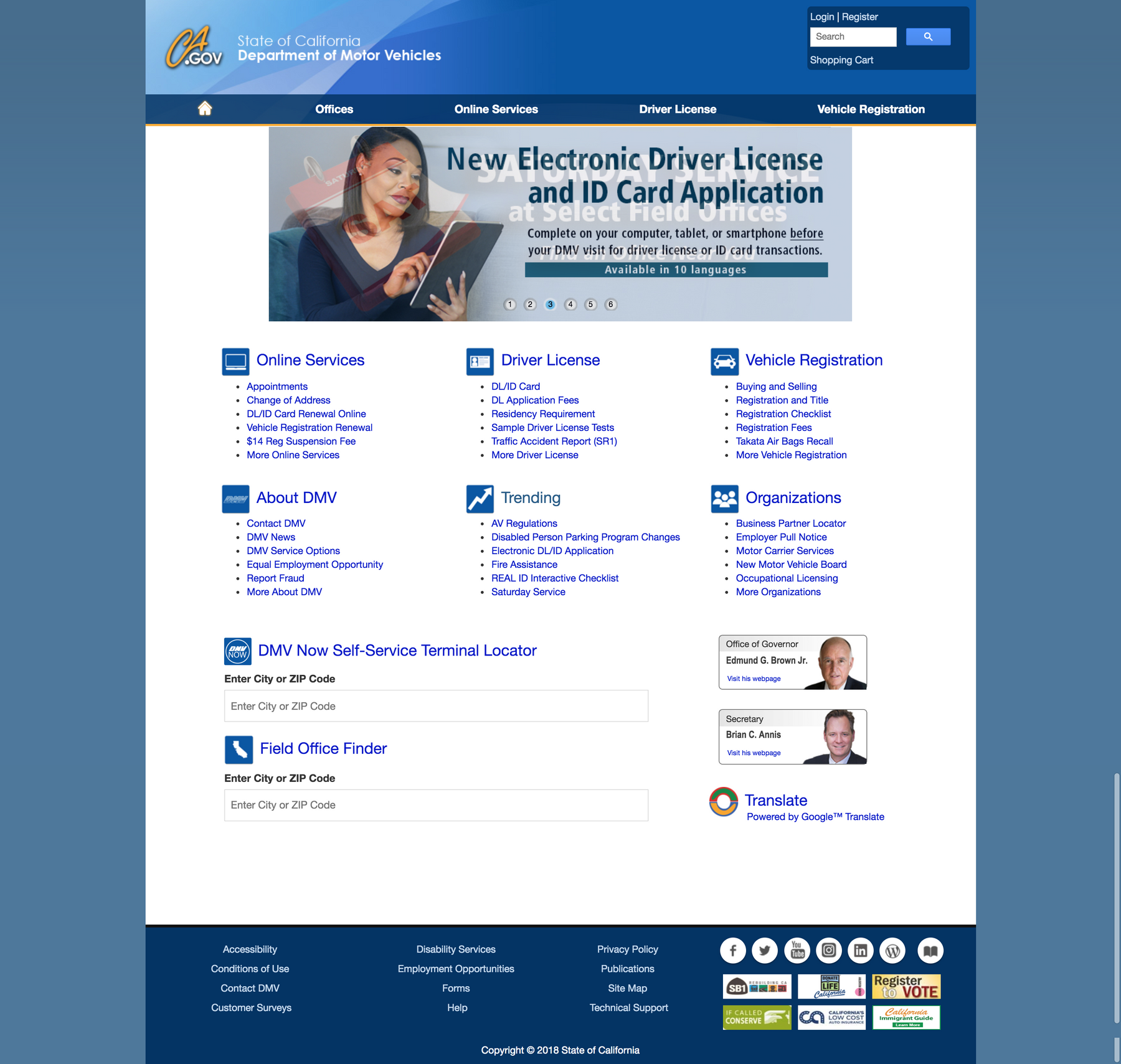
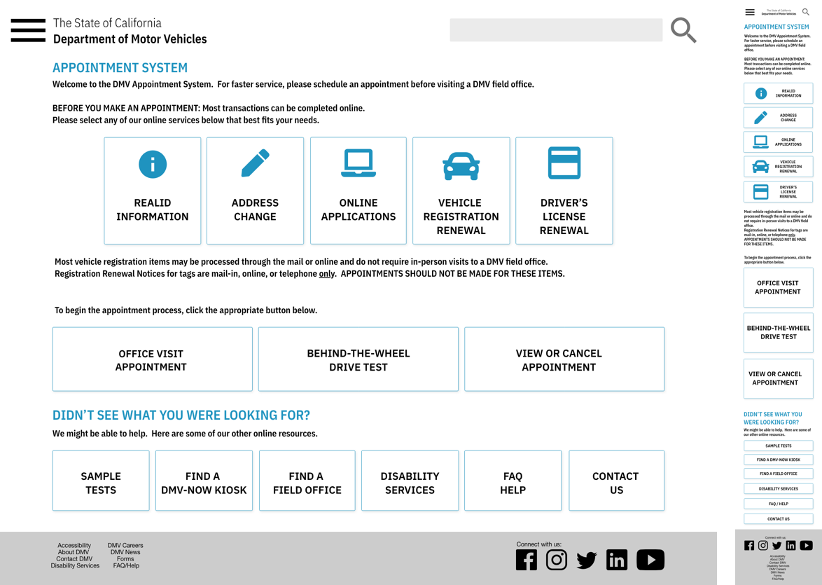
A design solution for The State of California, Deparment of Motor Vehicles. The design solution will allow users to utilize the online appointment system and online services in order to decrease the number of office visits and in-office wait times.
DMV Redesign

THE CHALLENGE

The DMV is vital resource to all, yet it is infamously known to be an inefficient and unpleasant experience. The volume of information within the site is easily overwhelming to users.

THE PROCESS

My Role
UX/UI Designer
Tools
Sketch, inVision, Adobe: Xd, Ps

Current DMV home page:
DMV - Current Version
  • Due to the DMV's crucial part in identifation and registration services; there is an abundance of information.
  • This easily overcrowds the landing page and it is not absolutely necessary.
  • The amount of information present can easily be reorganized after careful card sorting and analysis of the current information architecture.
  • DMV - Site Map

    THE PROBLEM

    I believe that users are not utilizing the online appointment system and are experiencing longer than necessary office visits. The amount of content is overwhelming to the user and is limiting the website's usability.


    We may solve this problem by creating a more simplified online presence by improving brand definition and heuristics, implenting clear CTAs, which will drastically enhance usability.

    We will know we have succeeded when we see an increase in activity on the online appointment system.

    THE SOLUTION

    Improving brand definition:
    DMV - Brand Definition
    Improving heuristics:
  • RECOGNITION OVER RECALL: adding graphic icons for users to easily idenfity what they're looking for
  • FLEXIBILITY & EFFICIENCY OF USE: simplyfing the home page & removing repetitive information and condensing the navigation bar
  • AESTHETIC & MINIMALIST: minimizing previously content-heavy pages and keeping site cohesive by adhering to style guide
  • DMV - Home
    DMV - Appointment System
    DMV - Error 404
    Forseeable challenges
  • There will be a drastic change to the website in contrast to what most people have seen for the past decade - more testing, more often
  • Track analytics as to how user engagement has increased or decreased.
  • Another good marker would be to analyze how users are utilizing online appointment and form systems.
  • Future developments
  • Find user trends through analytics and pin point which actions are most popular.
  • From there, we can further simplify the experience on the landing page when heavy content can't be avoided in other places